Visualizing audio data with matplotlib and Librosa
Visualizations play a crucial role in understanding and interpreting audio data. Here’s a comparison of different types of visualizations for audio data and their uses in various scenarios. The choice of visualization depends on the specific goals of the analysis, the nature of the audio data, and the intended application. Combining multiple visualizations can provide a comprehensive understanding of complex audio signals.
This section demonstrates how to visualize audio data, an essential skill in audio analysis.
Waveform visualization
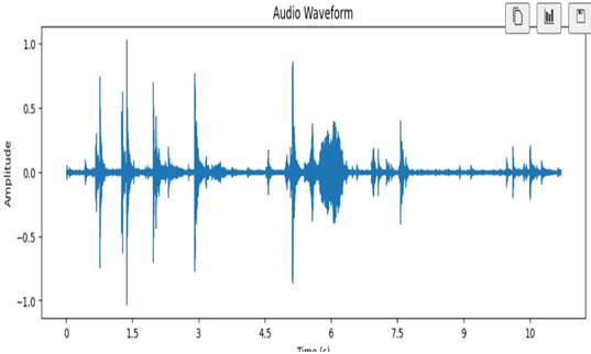
A waveform is a simple plot that shows how the audio signal changes over time. It’s like looking at the ups and downs of the audio as a line graph. In other words, a waveform represents the amplitude of the audio signal over time:
import librosa
import librosa.display
import matplotlib.pyplot as plt
Load an audio file
audio_file = “sample_audio.wav”
y, sr = librosa.load(audio_file)
Create a waveform plot
plt.figure(figsize=(12, 4))
librosa.display.waveshow(y, sr=sr)
plt.title(“Audio Waveform”)
plt.xlabel(“Time (s)”)
plt.ylabel(“Amplitude”)
plt.show()
In this code, we load an audio file using librosa.load(). We create a waveform plot using librosa.display.waveshow(). The x axis represents time in seconds, and the y axis represents the amplitude of the audio signal.

Figure 10.6 – An audio waveform
Use case: General signal overview
Purpose: Provides a visual representation of the audio signal’s amplitude changes, useful for general analysis and identifying patterns.
Loudness visualization
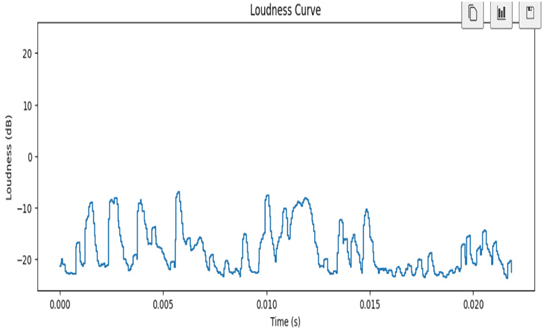
To visualize the loudness of an audio signal, you can create a loudness curve, which shows how the loudness changes over time. The loudness curve is essentially a plot of loudness against time. You can use the librosa library to compute loudness and Matplotlib to visualize it. Here’s a sample code snippet:
import librosa
import librosa.display
import matplotlib.pyplot as plt
Load an audio file
audio_file = “cat_1.wav”
y, sr = librosa.load(audio_file)
Calculate loudness using the RMS (Root Mean Square) energy
loudness = librosa.feature.rms(y=y)
Convert the loudness to dB (decibels)
loudness_db = librosa.power_to_db(loudness)
Create a loudness curve plot
plt.figure(figsize=(12, 4))
librosa.display.waveshow(loudness_db, sr=sr, x_axis=’time’)
plt.title(“Loudness Curve”)
plt.xlabel(“Time (s)”)
plt.ylabel(“Loudness (dB)”)
plt.show()
In this code, we load an audio file using librosa.load(). We calculate loudness using the RMS energy, which provides a measure of the amplitude or loudness of the audio.
To make the loudness values more interpretable, we convert them to dB using librosa.power_to_db(). We create a loudness curve plot using librosa.display.waveshow(). The x axis represents time in seconds, and the y axis represents loudness in dB.
This loudness curve can help you visualize how the loudness changes over the duration of the audio. It’s a valuable tool for understanding the dynamics and intensity of an audio signal.

Figure 10.7 – Loudness visualization
Loudness visualization serves as a versatile tool, offering valuable insights and benefits across a spectrum of applications and scenarios.
Scenario: Audio production and mixing.
Purpose: Assists audio engineers in understanding and adjusting the volume levels of different elements within a mix to achieve a balanced and pleasing sound.
Benefits: Enhances the quality and consistency of audio mixes by visualizing loudness dynamics.